In Part 1, I explored how
command-line package managers speak different languages. GUI package managers
transform the same operations into a different linguistic form: verbs become
button labels (npm update → “Update All”), status messages become animations
(scrolling text → spinning progress indicators), and error conditions become
modal interruptions (terminal errors → blocking dialogs).
These different interfaces don’t just change how you input information. They change how software communicates intent, conveys state, and handles errors.
Disclaimer: I’m not an Apple user. The macOS and iOS sections are based on online research and conversations with friends who use these platforms.
From wizards to stores: an evolution in ceremony
Modern app stores feel frictionless compared to their predecessors. This simplicity required decades of linguistic evolution, from “Next, Next, Finish” installers to one-click “Get” buttons.
Windows installers: the ceremonial era
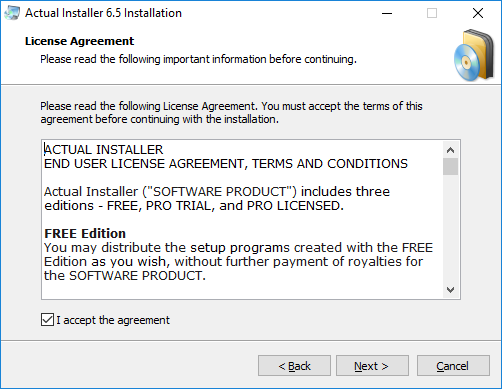
Classic Windows installers embodied ceremony. Double-clicking
PhotoshopSetup.exe initiated a multi-stage ritual: Welcome screen with “Next”
and “Cancel” buttons, license agreement with asymmetric “I Agree” versus “I Do
Not Agree” buttons, destination directory selection, component checkboxes, and
finally an “Install” button distinct from “Next.”
This flow used imperative language: “Choose installation directory,” “Select components,” “Create desktop shortcut.” Every button used complete action verbs: “Next” (not ”>”), “Install” (not “OK”), “Finish” (not “Done”). The vocabulary implied agency: you actively made choices rather than passively received software.
This verbosity served a purpose. Windows installers handled diverse scenarios: corporate deployments needed custom paths, power users wanted component selection. The wizard structure communicated that installation required informed consent at each stage. Yet the “Next, Next, Finish” pattern taught an important lesson: most users don’t want decisions, they want working software.
Summary
The wizard interface prioritized transparency and control through explicit multi-step prompts. While verbose, it acknowledged installation as significant system modification. The wizard’s real mistake was asking too many questions most users couldn’t meaningfully answer. Default-driven installation with advanced options tucked behind an “Advanced” button would have been wiser.
macOS drag-and-drop: linguistic minimalism
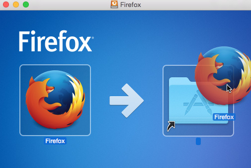
macOS eliminated most language. Download Firefox 143.0.4.dmg, double-click,
and a Finder window shows a Firefox icon and an Applications folder with an
arrow between them. Drag Firefox to Applications. Done. No progress bar, no
“Installation complete!” dialog.
Uninstallation mirrors this: drag the app to Trash, empty Trash. No wizard, no file counting, no confirmation dialogs (except when emptying Trash). The metaphor is consistent: if you can drag it in, you can drag it out.
This approach assumes prior knowledge. New macOS users sometimes struggle with the unstated instruction. The model also breaks when applications need system extensions or background services. Complexity the visual metaphor cannot express.
Summary
macOS’s drag-and-drop model replaces linguistic instructions with spatial metaphor, treating software as tangible objects you physically move. It’s useful and neat for simple installations but creates discoverability issues for newcomers and breaks down when apps need real system access. It’s simplicity through architectural constraint, not through solving the hard problem of making complex installations genuinely simple.
The app store revolution: single-click installation
The iOS App Store (2008) changed how software installation was described. You no longer “installed” software; you “got” it. Search for Instagram, see a “GET” button. Tap it. The button shows a loading circle, then becomes “OPEN.” The app is installed. No file copying visible, no directory selection, no multi-step confirmation.
Android’s Google Play initially used “INSTALL” instead of “GET,” acknowledging system modification. Both reduced installation to a single tap, but “Install” indicated files were being written while “GET” abstracted the process into simple acquisition. Google Play continues using “Install” today.
The Mac App Store (2011) and Microsoft Store (2012) adopted similar vocabulary, using “Get” for free apps. This shift from “Install” to “Get” reflects architectural abstraction. Users acquire apps rather than modify systems.
Summary
App stores transformed installation from a multi-step process into permission-granting. The shift from “Install” to “Get” reflects architectural abstraction. This linguistic simplification democratized software access but obscured technical reality. Google’s retention of “Install” shows more respect for what’s actually happening to your device, even if it’s slightly less friendly.
Button labels: verbs of action
In GUIs, button labels are the primary linguistic interface. These few words must communicate action, consequence, and often emotional reassurance.
Get versus Install versus Download
- iOS/Mac App Store: “GET” for free apps, shows price for paid apps. Tapping initiates a micro-commitment: GET → loading → OPEN.
- Google Play: “Install” for all apps, explicitly acknowledging system modification.
- Microsoft Store: “Get” for free apps, “Buy” for paid apps, matching mobile
simplicity despite Windows users spending decades “installing” via
.exefiles.
The choice between “Get” and “Install” reflects different philosophies. “Install” acknowledges system modification and respects technical literacy. “Get” treats software as content acquisition, optimizing for simplicity. Neither is wrong, but “Get” assumes system abstraction that didn’t exist when “Install” emerged.
Summary
Button label choices encode philosophical positions about user awareness. “Install” maintains technical honesty about system modification. “Get” prioritizes psychological simplicity by framing software as acquirable content. These aren’t mere synonyms; they shape whether users understand themselves as system administrators or content consumers. This makes software more accessible but also more opaque.
Update and Upgrade: convergence in GUIs
CLI tools distinguish updating metadata from upgrading packages. GUI package managers collapsed this into a single “Update” action. When available, the metadata is updated in the background, and the user only sees “Update” to install new versions.
GNOME Software, Mac App Store, Microsoft Store all use the word “Update” for “getting” the new version. iOS and Android abstract further: automatic updates by default, with user-visible language reduced to “Automatic Updates On/Off.”
This simplification works because GUIs maintain persistent visual state. A disabled “Update All” button with a spinner communicates “checking for updates” without requiring explicit user commands that CLIs need.
Summary
GUIs collapsed the CLI distinction between “update” (refresh metadata) and “upgrade” (install new versions) into a single “Update” action. This leverages visual affordances that communicate process without explicit commands. It’s the right choice for GUIs. Users shouldn’t need to understand package metadata versus package binaries.
Remove, Uninstall, Delete: degrees of permanence
- Windows: “Uninstall” in Settings → Apps, acknowledging that reversing installation requires action.
- macOS: Drag to Trash or “Move to Trash,” using deletion vocabulary for uninstallation.
- iOS: Split between “Remove from Home Screen” (icon stays in App Library) and “Delete App” (complete uninstallation). This distinction addresses real complexity but imposes learning costs.
- Android: “Uninstall” with straightforward complete removal.
The choice between “Remove,” “Uninstall,” and “Delete” reveals platform assumptions. “Uninstall” is technically honest. “Delete” connotes irreversibility. “Remove” is spatially ambiguous. Users interpret “delete” as more permanent than “remove,” affecting their willingness to experiment.
Summary
Removal terminology reveals platform assumptions about data permanence. “Uninstall” is technically honest and well-understood. “Delete” sounds more permanent than “remove,” affecting user confidence in reversibility. iOS’s split between “Remove from Home Screen” and “Delete App” creates a new problem while solving an old one. Android and Windows get this right with straightforward “Uninstall.”
Progress indication: visualizing the invisible
CLI package managers show scrolling text, percentages, and download speeds. GUIs translate these into visual metaphors.
The progress bar: a language of waiting
Determinate progress bars (■■■■■■□□□□ 60%) appear when file size is known. The Mac App Store downloading Xcode shows “Downloading… 2.3 GB of 8.1 GB” with a filling bar. This communicates that the system knows completion and is 28% through.
Indeterminate progress bars admit ignorance. Spinning circles or animated dots communicate “something is happening” without completion estimates. These appear during unpredictable operations like “Configuring system settings…”
Classic Windows installers damaged trust with inaccurate estimates: “Time remaining: 2 minutes” lasting fifteen minutes, bars stalling at 99%. Modern installers improved by switching to indeterminate progress during uncertain operations rather than making false promises.
Progress bars give users permission to wait. Without them, users assume freezing. The message: “Trust me, I’m working.”
Summary
Progress bars are contracts about waiting. Determinate bars must be honest; inaccurate estimates damage trust more than admitting ignorance. Windows installers of the 2000s broke this contract repeatedly, training users to distrust progress indicators. Modern systems learned the lesson: if you don’t know how long something takes, don’t pretend you do.
Status messages: what to say while working
- Technical specificity: Traditional Linux package managers showed scrolling package names (“Installing libgtk-3-0…”). Technical users appreciate details; others see alphabet soup.
- Abstract reassurance: Modern app stores hide details. “Installing…” beneath a progress bar. No package names, no dependencies mentioned. Optimizes for users who don’t need technical specifics.
- Playful humanization: Some installers add personality (“Summoning digital citizens…”). This works for short operations but wears thin over five-minute installs.
CLI output scrolls away, so verbosity is acceptable. GUI status messages persist on screen, demanding careful word selection to avoid fatigue.
Summary
Status messages reveal platform assumptions about user technical literacy. Technical specificity respects expert users but alienates novices. Abstract reassurance optimizes for confidence over comprehension. Playful humanization risks condescension during long operations. “Reticulating splines” is funny once, not while you’re actually waiting.
Modal dialogs: linguistic interruption
Modal dialogs demand response before proceeding, creating linguistic weight absent in CLI tools.
Permission and confirmation: asking versus telling
“Are you sure you want to uninstall X?” casts doubt, questioning your certainty to prompt reconsideration. It doesn’t ask “Do you want to uninstall?” (simple preference) but “Are you sure?” (challenging confidence).
“This app would like to send you notifications” uses polite request phrasing (“would like to”) rather than demand (“requires”) or necessity (“needs”). The language gives users control while acknowledging the application’s desire.
“Installation requires administrator access” states necessity, not preference. It’s a security gate rather than a negotiable choice. The question format (“Do you want to allow…?”) is courtesy. Clicking “No” simply fails the installation.
The distinction between asking, confirming, and requiring reflects whether user choice is real or illusory. Honest modal language matches architectural reality: don’t frame mandatory requirements as questions, and don’t question user certainty when simple confirmation suffices.
Summary
Modal dialogs wield interruption power, demanding linguistic precision. “Are you sure?” questions user judgment, which is appropriate for destructive actions but patronizing for routine ones. “Would like to” respects user authority. “Requires” acknowledges immovable constraints. The worst modals are fake questions that ask “Do you want to allow?” when “No” simply breaks functionality.
Error messages: blame and recovery
“Installation failed”: Blameless but unhelpful. Users know what happened but not why or how to fix it.
“Could not install X: insufficient disk space”: Provides specific cause with actionable information. “You need 2.5 GB. You have 1.1 GB available.” Enables self-service recovery.
“Error 0x80070005: Access Denied”: Technical error codes are useful for support searches but hostile to typical users. Represents linguistic abandonment. The system stopped translating technical state into human-useful information.
“Installation cannot continue: macOS Catalina or later required”: Clear requirement with implicit solution. Identifies the gate and the key to unlock it.
The best error messages follow: what failed, why it failed, how to fix it. “Installation failed” (what) “because disk is full” (why) “Free up space and try again” (how). This provides context, cause, and path forward. The worst provide only “what” or pair it with cryptic error codes.
Summary
Error messages are the most critical linguistic moment. Users are blocked and need both understanding and agency. The three-part structure (what failed, why, how to fix) respects user intelligence while providing actionable guidance. Windows’s hex error codes remain a masterclass in user hostility. They help neither typical users nor developers, only support forum searches.
CLI versus GUI: complementary languages
CLI and GUI package managers optimize for different communication goals.
GUIs excel at:
- Emotional reassurance through progress visualization and friendly messages
- Spatial metaphors (drag-and-drop installation)
- Visual state (disabled buttons, badges showing update counts)
- Permission negotiation (modal request-response patterns)
CLIs excel at:
- Operational granularity (separate
apt updateandapt upgrade) - Composability (combining flags into custom operations)
- Technical transparency (showing dependency resolution details)
- Scriptability (commands as automatable language)
Both struggle with:
- Security vocabulary (neutral language for security-critical operations)
- Dependency explanation (why installing X requires Y)
- Reversibility clarity (can you undo this?)
The medium shapes the message: GUIs reassure, CLIs inform. Neither is superior. They optimize for different users doing different work.
Summary
GUIs excel at emotional reassurance and visual state communication. CLIs excel at operational granularity and technical transparency. Both struggle with security vocabulary, dependency explanation, and reversibility clarity. The best package management experiences increasingly combine both: CLIs gaining progress bars and color, GUIs exposing terminal output for advanced operations.
The cost of simplification
Modern GUI package managers achieve remarkable simplicity. “Get” means the app appears. “Update All” means everything is current. This democratizes software installation.
Costs include:
- Loss of control: No installation location choice, component selection, or configuration options
- Hidden complexity: Users don’t build mental models of system operation
- Inconsistent metaphors: iOS’s Remove/Delete split, Windows mixing Store and traditional installers
- Support challenges: When simplified interfaces fail, users lack vocabulary for troubleshooting
The question isn’t whether to simplify but what to preserve while simplifying. The best GUI package managers find linguistic middle ground: simple enough for novices, precise enough for troubleshooting, honest about constraints.
Summary
Linguistic simplification trades control and transparency for accessibility. “Get” democratizes software installation but hides system modification. The cost manifests when simplification breaks down. Users trained on frictionless interfaces lack vocabulary to describe or troubleshoot failures. iOS pushes furthest toward abstraction and has users who genuinely cannot explain what “installing an app” means. This matters when things go wrong.
Closing thoughts
GUI package managers speak through buttons, progress bars, and modal dialogs rather than typed commands. This shift enabled simplification that made software installation accessible to billions.
The linguistic choices matter. “Get” versus “Install” shapes user understanding of system modification. Progress bars commit to managing waiting. Error dialogs must balance technical accuracy with usefulness.
CLI package managers optimize for power and composability, speaking a language where verbs combine into sophisticated operations. GUI package managers optimize for simplicity and reassurance, hiding complexity behind good defaults.
Someone designed each button label, progress bar behavior, and error message. Those linguistic choices accumulate over millions of interactions, teaching users what software installation means and whether their computer is a black box or an understandable system.
Next time you press “Get” or see a progress bar, consider how its language can improve.
My personal approach
I’m comfortable with GUI package managers for simple tasks, but prefer the CLI when I want deeper understanding or control. On mobile, that distinction rarely applies. I use F-Droid and the Google Play Store. On Arch, I keep GNOME Software for straightforward Flatpak installations but default to the CLI otherwise, even when graphical options exist. The practical outcomes are similar, but the mental models behind each approach remain interesting.